
Whether you’re an attorney, accountant, doctor, or any business owner in the professional service industry, most likely your website was built with you in mind. However, a website should be created through the customers perspective, and NOT the owners.
This simple mistake starts off with a polished final product, but then a few months down the line, you either forget about it =( or you’re scratching your head in awe thinking, “Why isn’t my website bringing me any business?”
Here are 5 mistakes that I noticed almost every small business website owner does on their website’s home page.
Image Sliders With No Purpose
This was a huge trend with websites for quite a long time. Big giant images on top that slide right to left. The thought process usually goes, “I want to mention a bunch of different services and things we do, and I want it all in one place.”
There’s a huge problem with this though… it just doesn’t work! There’s a great article on Instapage the mentions a few reasons why sliders don’t work.
Think of it like this, and I may repeat this a few times in this post; when you’re online, you’re competing with peoples attention. Sliders just don’t grab it.
Do they look nice? Sure! Is someone sitting there, waiting and clicking through all of your cool slides? No, they’re not.
Sliders usually end up taking a lot of space, and most of the time, people will only see the first one.
[clickToTweet tweet=”Sliders usually end up taking a lot of space, and most of the time, people will only see the first one.” quote=”Sliders usually end up taking a lot of space, and most of the time, people will only see the first one.”]
You can Google why sliders don’t work and find a bunch of different article with proven evidence of their uselessness, so I’ll just leave this one at that.
Is there any circumstance where sliders do work?
In my opinion, if you have a core message, and only the background slides, then yes, it would probably work better. But keep in mind that any type of movement on a website is distracting. If you feel in your core that you MUST use a slider even though they have been proven to not work, limit it to about 3, and make sure each one is super clear, maybe even exciting to the user.
Your Website Doesn’t Have A Clear WIIFM Message
What’s In It For Me, WIIFM.
“Welcome to my site, trusted since 1492!”
“We’re a full service x”
“We’ll help your business grow!”
I see it all the time. I like to call this passive content or ‘Easily Forgettable’ content or even “this is just used to take up space, no need to read this at all” content. It’s the stuff that nobody reads or even cares about because they saw it 100 different times on 100 different websites.
My favorite ones are the ones that try to get all markety and gimmicky but nobody really understands it.
“Supporting Families from Birth To Legacy” (ok?)
“The attorneys at x have the experience to protect your legal rights.” (Well I hope so!)
“Tax and accounting services you can trust” (How do I know that?)
*These are taken from real websites by the way.

Whats In It For Me, WIIFM, is what every website needs to display. When someone goes onto your website, what’s in it for them? Are you 100% clear on what you’re offering? Is it the first thing that they see?
“Avoid The Tech Talk, Contact Us Anytime”
“Beautiful Websites at an Affordable Price”
“Your “Web Professional” is gone and you’re left with a mess of a site and no support. We’ll Get You Back On Track.”
Do you see a distinct difference in the messaging?
WIIFM? With SureFire it’s easy communication, low-cost entry, and the guarantee and confidence that we’re not going to disappear, overcharge, or do sloppy work on your website because we recognize the problems small business owners face.
When you’re getting your homepage ready, make sure your users know exactly what you’re offering, you recognize the problems they have, and you are the solution. Be clear, and always test!
You Don’t Have A Clear CTA (Call To Action)
 I always treat each page as if it’s a landing page. Meaning, every page should have 1 goal, and that goal should be clear and executable. This is especially true with our new launch. Focus on Clear Call To Actions via Buttons or Links!
When someone is done reading your content, what should they do now?
Maybe you want them to call you. Maybe you want them to contact you. Whatever it is you want them to do, that should be your main goal on that page.
Focus on the goal, and use the content and spacing to get them to accomplish that goal.
The problem I usually see is websites using their homepage as a giant brochure to mention every single thing they do and then having links to all the different pages. This isn’t a horrible method but you have to be clear on what you want your user to do. What’s the MAIN goal you want from them? Don’t flood your users with too many choices, that’s where content marketing can really help out.
There’s Nothing Useful Above The Fold
The fold is the part of the website where what’s immediately visible and what’s hidden meet.
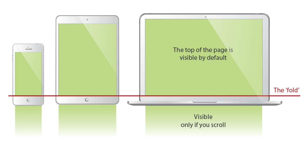
That line right there is super important. It’s what everyone sees when they first visit your website (also a reason why sliders don’t work very well). This is that prime real estate. This area on your website is where you have about 3 seconds to grab someone’s attention.
Most people don’t realize this and end up wasting this space with something like a big logo, or a giant “Hi! Welcome to my site!“.
All of that is useless! Nobody cares about your name, they care about WIIFM. You don’t have to welcome me to your website, I’m already there, give me my info!
[clickToTweet tweet=” You don’t have to welcome me to your website, I’m already there, give me my info!” quote=” You don’t have to welcome me to your website, I’m already there, give me my info!”]
Use this area to engage your user. Appeal to what they want and give them something to do (Call To Action).
Your website is way too quick to pull the trigger

I’m pretty sure everyone has done this or is still doing this. It’s almost like, you NEED to put a CTA above the fold but we never know what to put, so we just add a “buy now” or “Contact Us!”
The problem with this is, you haven’t earned my trust enough to purchase from you yet. (BTW, I’m pretty stoked I got to put a family guy meme on this post!)
Could you imagine walking up to someone for the first time and this was the first thing you said:
“Hi, Welcome! I make websites. Buy My Service Now!”
I can pretty much guarantee that 100% of people will say “NO!”
Earn the trust of your users. Don’t sell to them so quickly. Why should someone use your service? Maybe you can’t fit all the amazing things you do in the space above the fold, that’s totally cool, add a button and flesh out those thoughts.
What would even be cooler is if you had an explainer video, that just shows in 1 – 2 minutes what you do and how you help (if you need one, definitely get in touch with me).
These are just a few things that many websites do on their homepage, and don’t even realize it can be costing them leads. If you’re looking to get your site revamped, you should definitely reach out to us.